Teams
Product, Merchandising, CX, Engineering
Tools
Figma, Baymard Institute, Eppo
Year
2025
%201%20(2).avif)
Overview
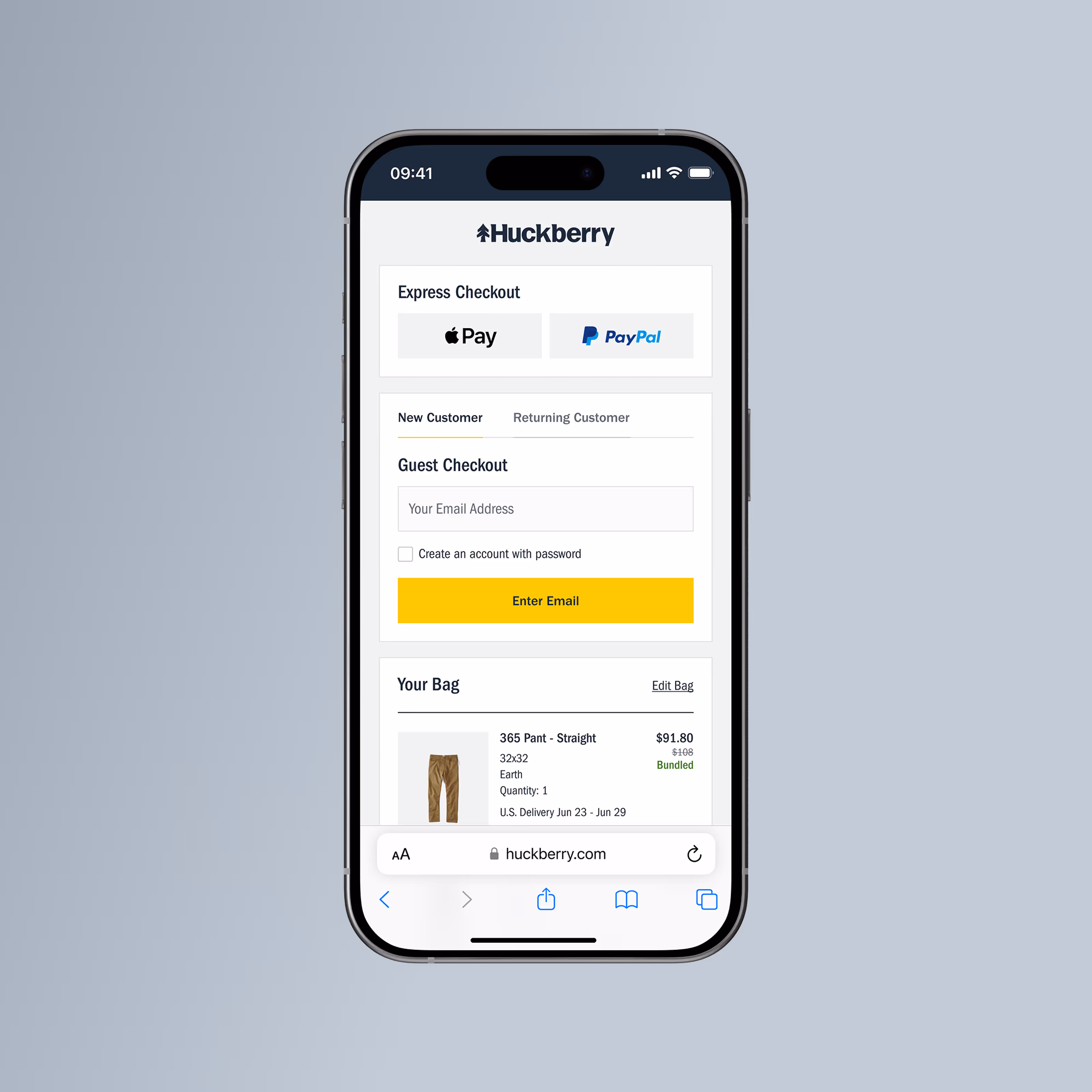
Huckberry’s core products drive a significant portion of both revenue and long-term customer loyalty. While many of these products supported bundle pricing, that value was primarily communicated on product listing and product detail pages.
Once customers reached the cart, bundle opportunities were largely invisible — meaning many shoppers completed checkout without realizing they could add complementary items at a discount.
This project focused on introducing cart-based bundling in a way that felt timely, contextual, and low-friction, while protecting checkout momentum and maintaining a premium brand experience.
My Role
I led UX and UI design for the cart bundling initiative, owning the experience from early concept through final execution.
I partnered closely with Merchandising and Engineering to ensure the solution balanced business goals, technical constraints, and checkout usability.
Responsibilities included:
- Researching bundling patterns across ecommerce brands
- Synthesizing findings into a clear strategic recommendation
- Collaborating with Merch to define bundle logic and rules
- Partnering with Engineering to work within pricing, inventory, and variant constraints
- Designing the end-to-end cart bundling experience
The Impact
The Problem
Despite strong performance from core products, customers rarely purchased multiples in a single transaction.
Bundle pricing existed, but visibility was limited to PLP and PDP badging — meaning customers often reached the cart without realizing a bundle was available. At the same time, introducing new merchandising elements into checkout carried risk:
- Disrupting checkout momentum
- Reducing trust through overly promotional patterns
- Overloading users during a high-intent moment
- Compounding visual complexity on mobile
Core Challenges
The core challenge was not whether to recommend, but how to introduce contextual suggestions without breaking flow or confidence—balancing system, design, and trust constraints at a moment of high purchase intent.
- Support multiple bundle rules (e.g., Buy 2 Save X, Buy 3 Save Y)
- Clearly differentiate suggested bundles from items already in the cart
- Design for mobile-first constraints
- Respect pricing, inventory, and variant limitations
Research & Direction Setting
Competitive & Industry Research
I reviewed bundling and cart patterns across a range of ecommerce brands. While many surfaced add-ons or bundles, most implementations suffered from at least one of the following:
- Too many options presented at once
- Disruption to checkout flow
- Lack of clarity around pricing or value
To ground decisions, I also referenced Baymard Institute research around cart behavior, hierarchy, and cognitive load. While Baymard does not explicitly cover bundling, its findings around friction and decision fatigue strongly informed our approach.
.avif)
Key Insights
Together, these inputs helped shape a direction that prioritized clarity and momentum over aggressiveness.
01.
Visibility must be earned
Bundle offers performed best when introduced subtly, not aggressively.
02.
Moment of commitment matters
Users were most receptive immediately after adding an item to cart.
03.
Fewer choices perform better
Presenting one relevant bundle outperformed multiple options.
04.
Checkout momentum is fragile
Anything that felt sales-driven reduced trust and engagement.
Internal Collaboration
To validate direction and constraints, I worked closely with:
- CX, to understand common friction around sizing and adding multiples
- Engineering, to define feasibility around inventory and pricing logic
- Merchandising, to align on core product strategy and bundle rules
This ensured the solution was grounded in real business and technical constraints, not just UX theory.
Iteration & Learning
Early exploration focused on testing how much information users could process without slowing checkout. We explored:
- Different visual weights for the bundle module
- Multiple placement options within the cart
- Expanded vs. collapsed default states
- Levels of detail shown upfront vs. progressively
Through iteration and testing, it became clear that simplicity outperformed richness.
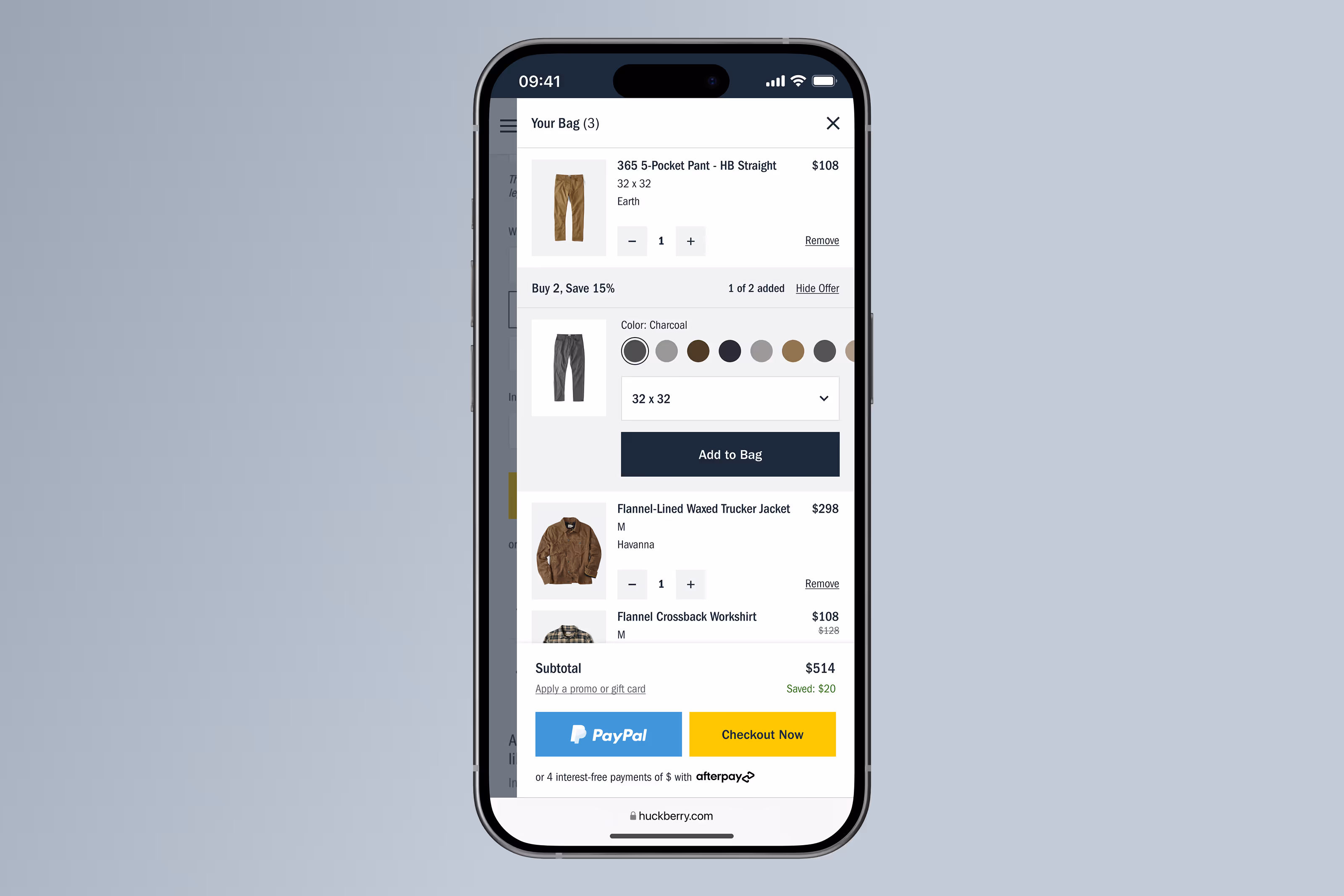
Final Experience
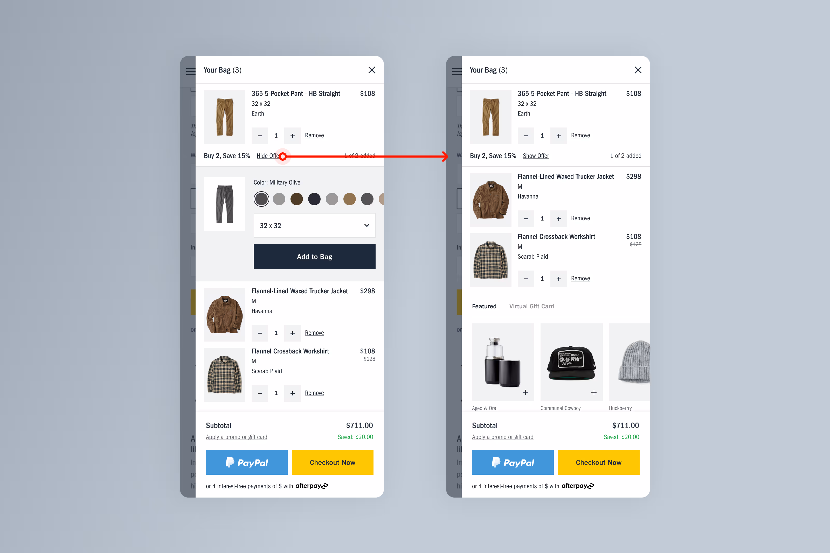
1. Contextual Bundle Reveal
The bundle module appears shortly after an item is added to cart, reinforcing relevance without interrupting momentum.

2. Clear Value Communication
Bundle savings are clearly labeled and reflected in pricing, helping users understand both the offer and the benefit at a glance.
.avif)
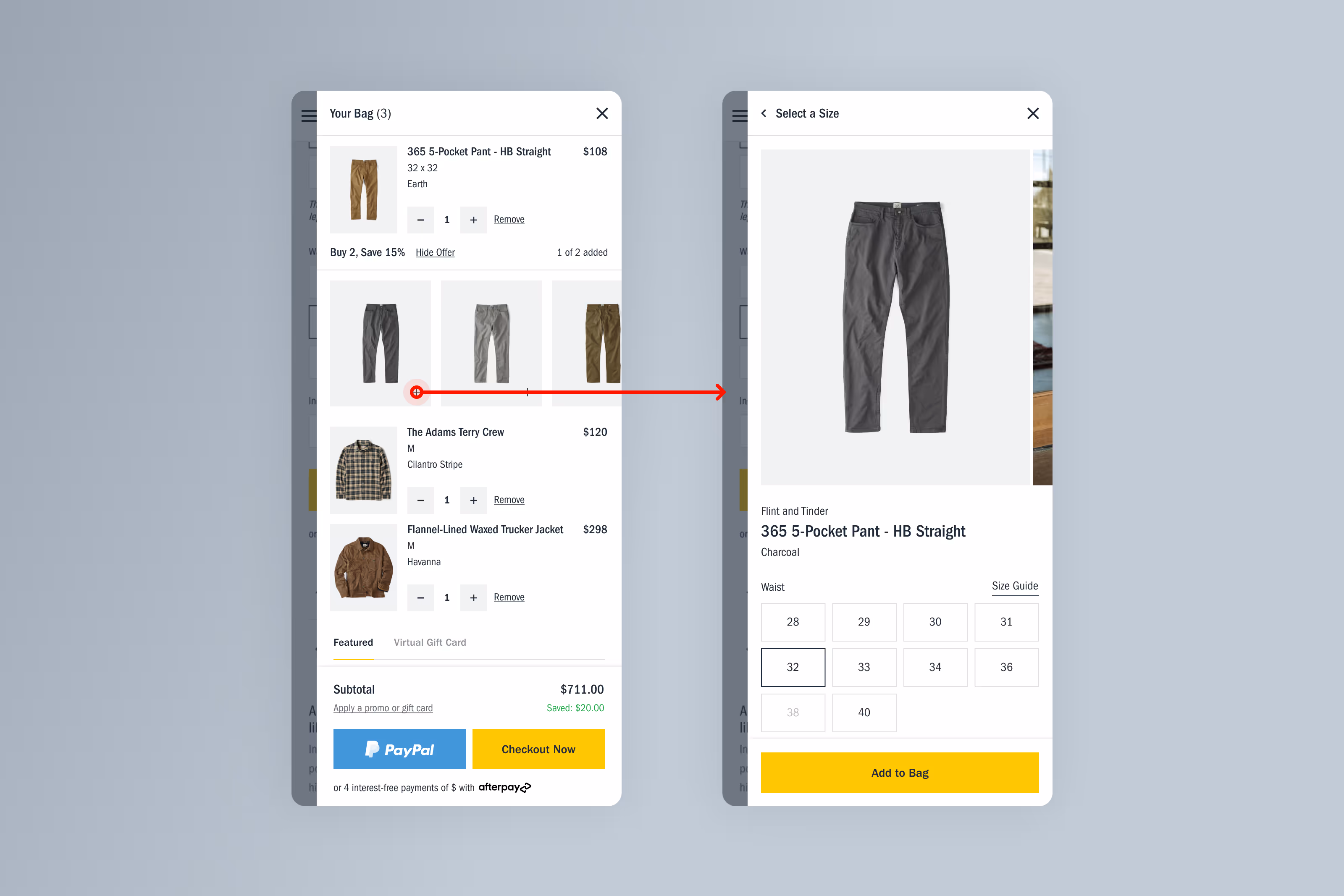
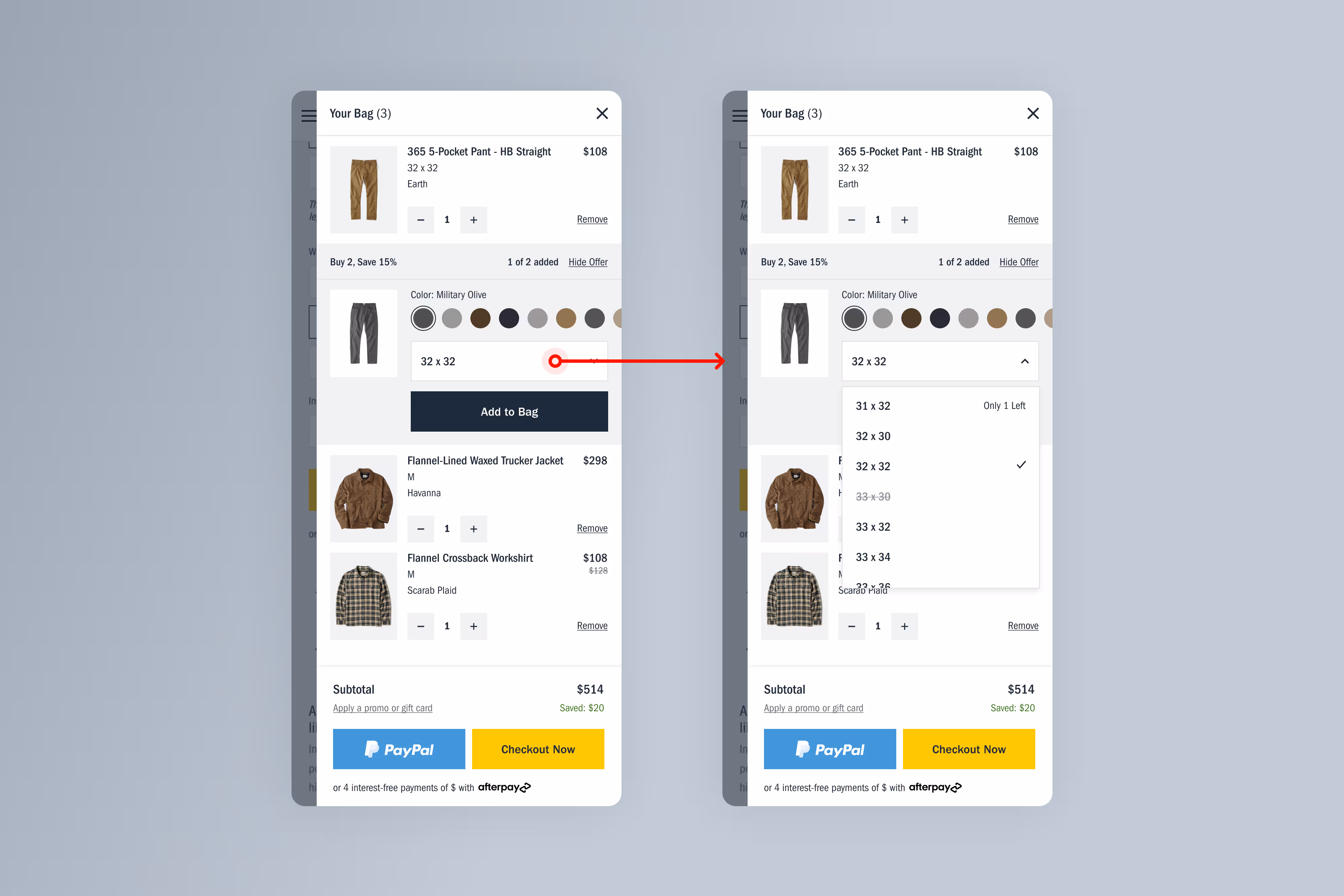
3. Size & Variant Handling
Variant selection is handled inline with clear availability states, keeping the cart clean while supporting complex inventory rules.
Results & Reflection
This project reinforced the importance of restraint in high-intent moments.
By positioning bundling as a helpful suggestion — rather than a sales push — we increased engagement without compromising trust or usability.
Outcomes
Overall, the work demonstrated how thoughtful merchandising, paired with strong UX fundamentals, can drive meaningful business impact without compromising user trust.
- +3.12% increase in UPT
- Established a scalable cart bundling framework
- Strong engagement from mobile users
- Positive early indicators across conversion and add-to-cart behavior
While the experiment did not reach full statistical significance within the test window, performance trended positively across all key metrics. More importantly, it established a repeatable, low-risk pattern for future merchandising initiatives.
Reflection
This work highlighted how effective merchandising depends as much on when something is shown as what is shown. By respecting user momentum and designing with clarity over persuasion, we were able to drive measurable impact without compromising the checkout experience.