Teams
Marketing, IT Engineering, QA
Tools
Sketch, Magnolia CMS, InVision
Year
2021
Overview
Texas State University’s CMS supported 500+ decentralized editors managing thousands of pages across academic, admissions, and marketing websites. Editors ranged from administrative staff to student workers, most without design or technical backgrounds.
This project focused on improving the CMS editing experience by reducing friction, introducing accessible design patterns, and enabling non-technical users to confidently create consistent, on-brand pages.
My Role
I led UX strategy and interaction design for the CMS editing experience, working cross-functionally with Marketing, Engineering, and QA. I owned:
- Research synthesis and user modeling
- UX strategy and system-level design decisions
- Interaction and information architecture for editor workflows
- Design of modular layout components and guardrails
- Collaboration with engineering within Magnolia CMS constraints
- Usability testing, iteration, and validation
I was responsible for balancing editor needs, accessibility requirements, brand standards, and technical limitations into a scalable solution.
The Impact
The Problem
The CMS was designed around maximum flexibility, assuming editors could make informed layout and design decisions. In practice, this created systemic problems:
- Unlimited layout options produced inconsistent and inaccessible pages
- Brand standards were difficult to enforce across departments
- Marketing and IT teams absorbed the cost through QA fixes and manual intervention
The core issue was not usability of individual controls — it was a system design problem.

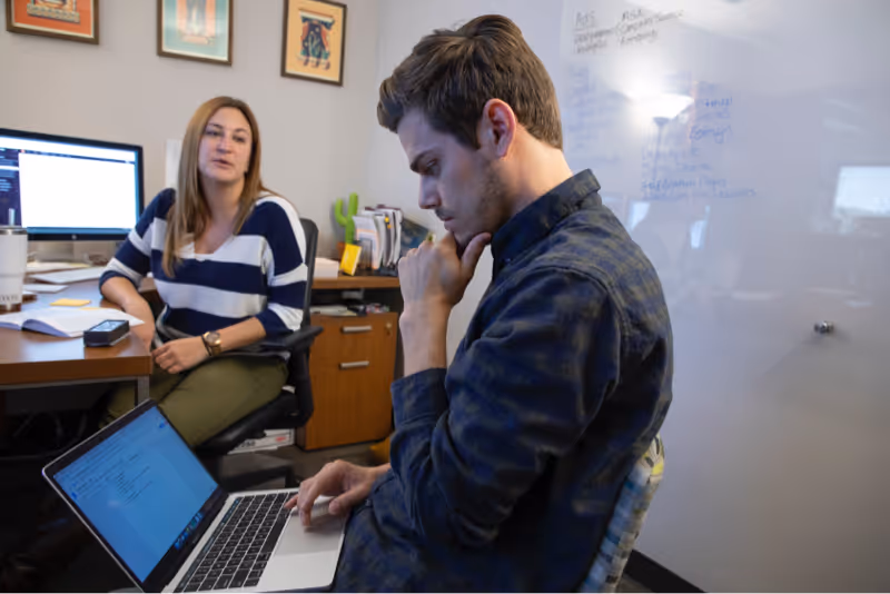
Research & Discovery
Understanding Real-World CMS Usage
I reviewed existing research, support tickets, and stakeholder insights, then validated findings through editor feedback. Three primary user types emerged:

Sarah — Administrative Assistant
Experience: Novice
Goal: Keep department content updated
Pain Point: Low confidence making layout and accessibility decisions
“I don’t have design experience, but someone has to manage the site.”

Twister — Lecturer / Digital Director
Experience: Advanced
Goal: Create polished, structured pages
Pain Point: Templates felt outdated and restrictive
“I often have to use workarounds to get the layout I want.”

Anna — Student Worker
Experience: Beginner
Goal: Gain experience while maintaining site quality
Pain Point: CMS felt unintuitive compared to modern tools
“I’ve used tools like Squarespace — this feels harder than it should.”
Key Insights
Across all users, consistent patterns emerged:
01.
Editors lacked confidence
Users were unsure whether they were building pages “correctly.”
02.
Excessive flexibility caused systemic errors
Unlimited layouts increased inconsistency and accessibility violations.
03.
Guidance needed to be embedded in the UI
Documentation was rarely used; users needed in-context, visual direction.
04.
Training did not scale
The system needed to prevent errors by default, not rely on education.
Design Strategy
Based on research, I defined two system-level goals:
Reduce Cognitive Load Through Guided Creation
Limit decisions editors were never equipped to make and guide them through clear, step-by-step flows.
Enforce Quality Through Structure, Not Policing
Shift responsibility for accessibility, hierarchy, and brand consistency from users to the CMS itself.
Core Challenges
- Support editors with widely varying skill levels
- Reduce accessibility and layout errors without blocking productivity
- Maintain brand consistency across decentralized teams
- Work within the constraints of Magnolia CMS
- Design a system that scaled across thousands of pages and frequent contributors
Key Tradeoffs & Constraints
Flexibility vs. consistency
We removed free-form column layouts, knowingly reducing creative freedom for advanced users to dramatically improve consistency and accessibility at scale.
Customization vs. speed
Prebuilt sections limited visual experimentation but reduced errors and page creation time.
Ideal UX vs. CMS constraints
Magnolia CMS limited real-time previews and interaction patterns; we compensated with thumbnail-based section selection and progressive disclosure.
These decisions were intentional and aligned with system-level outcomes.
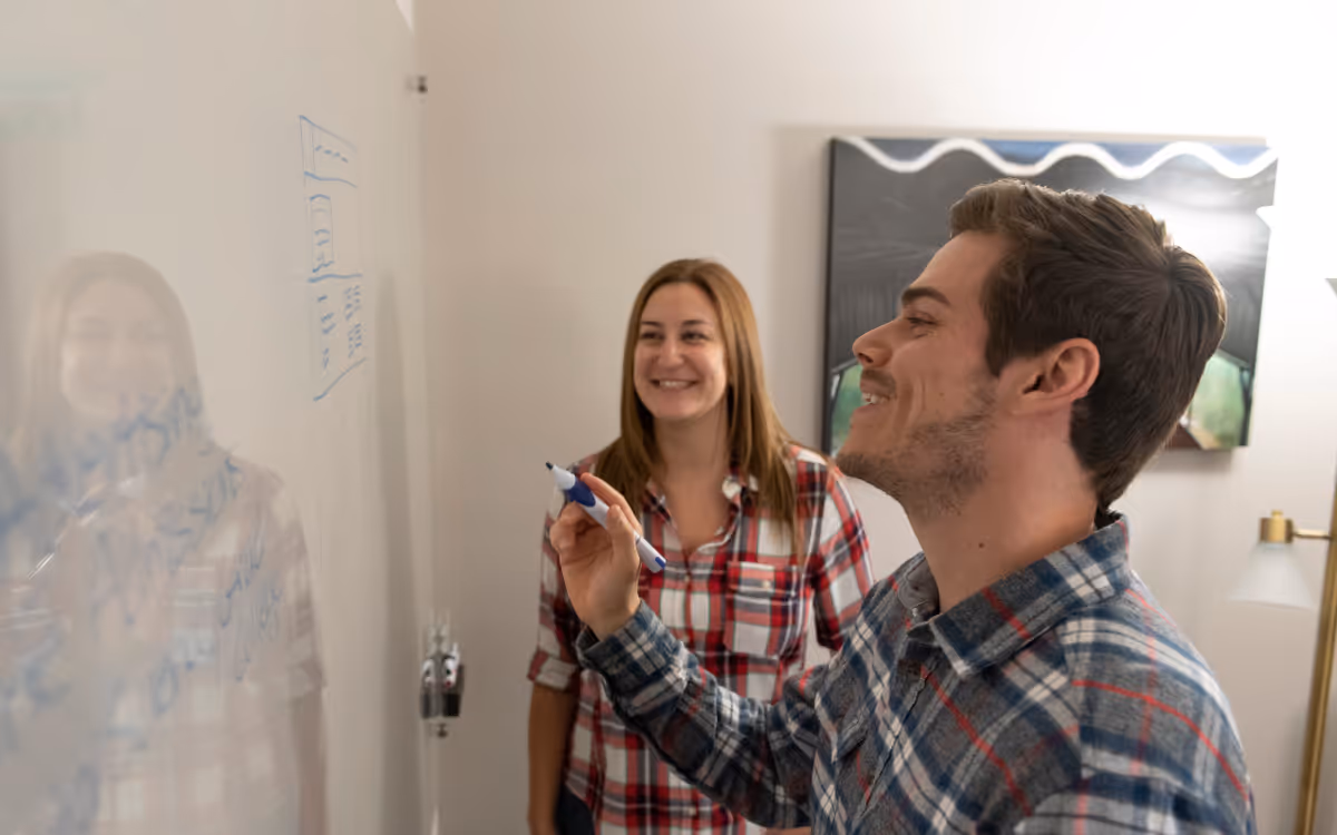
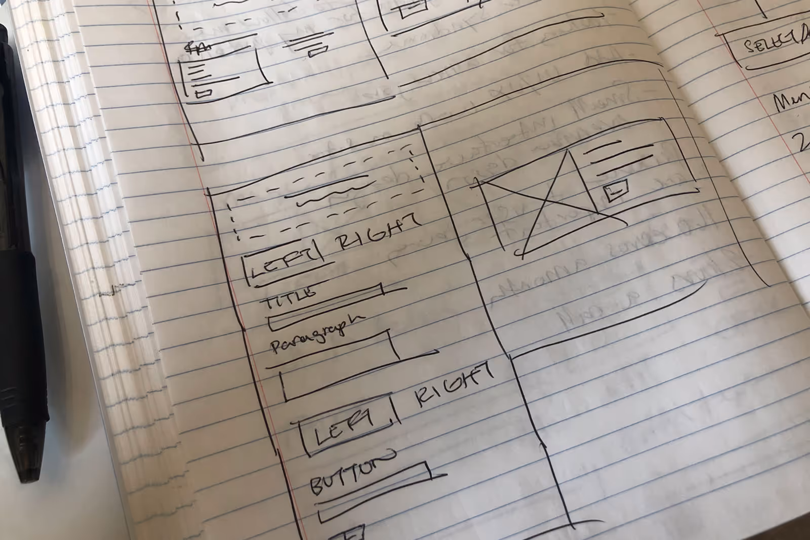
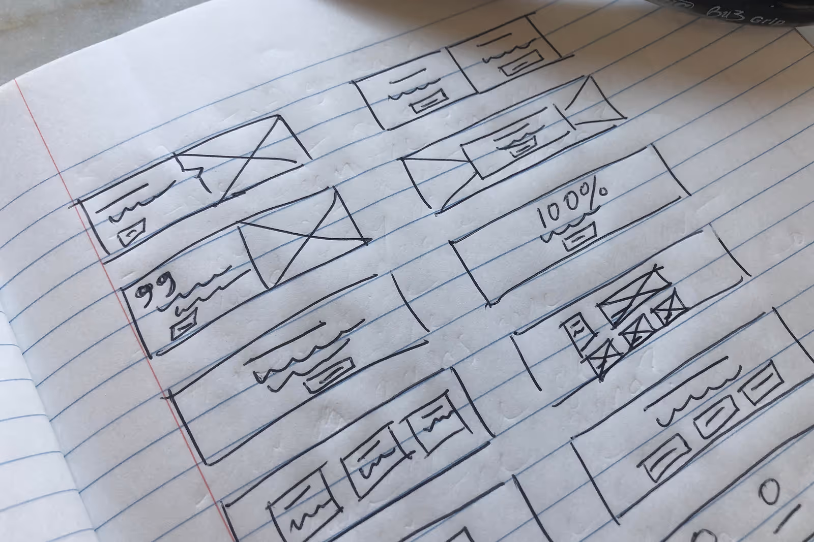
Iteration & Design
I explored multiple concepts through sketches and wireframes, refining them based on usability, scalability, and technical feasibility.
Design Principles
- Prebuilt layouts instead of freeform design
- Clear hierarchy and visual consistency
- Strong mobile responsiveness
- Accessibility by default
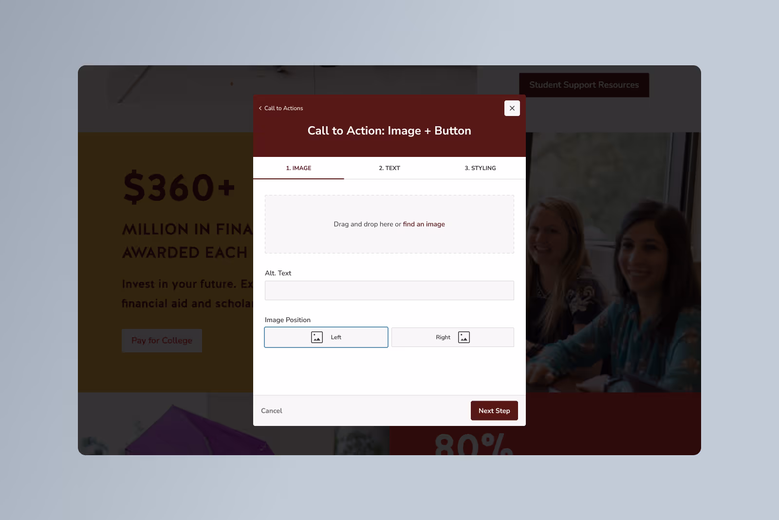
Final Experience
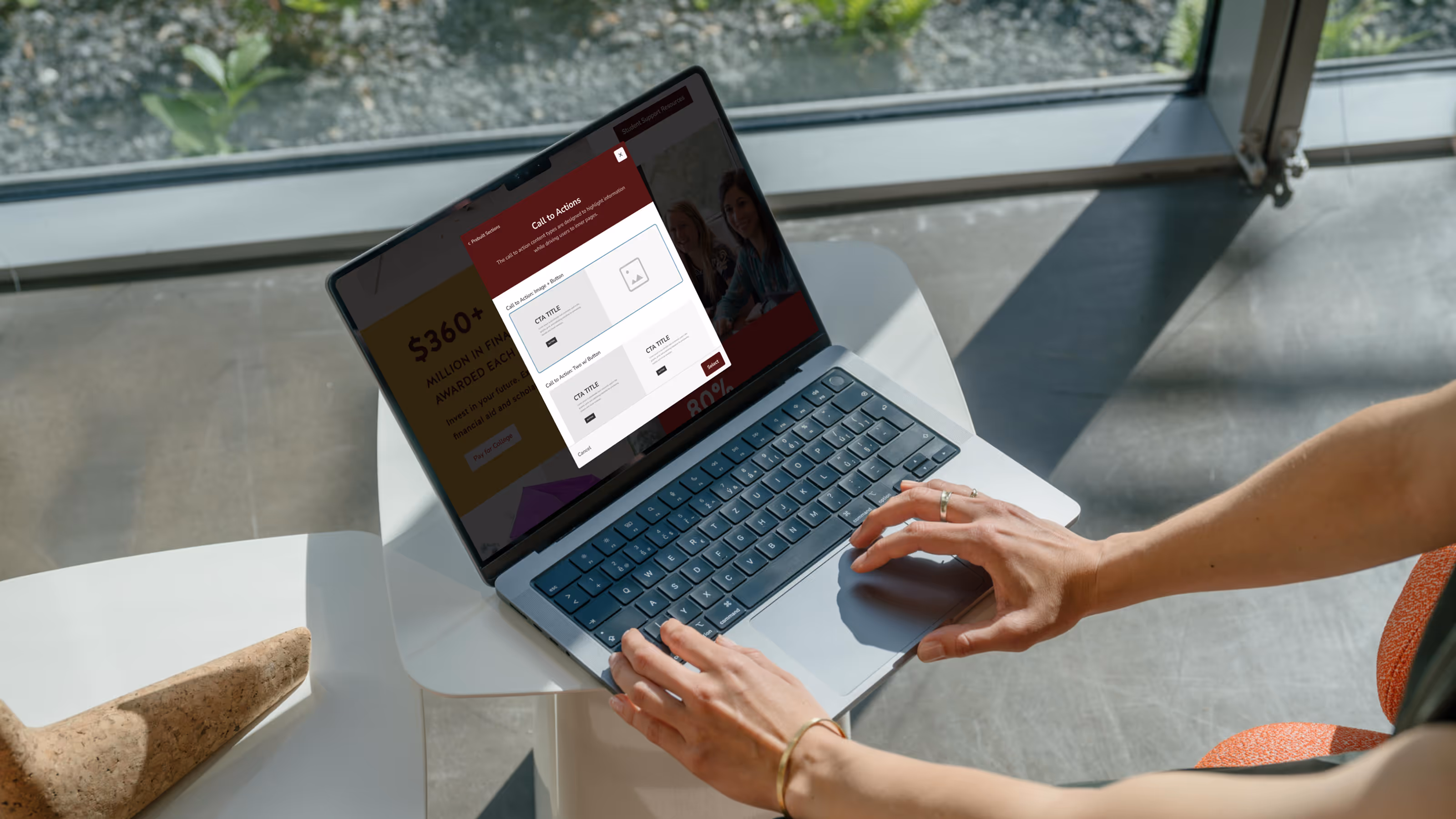
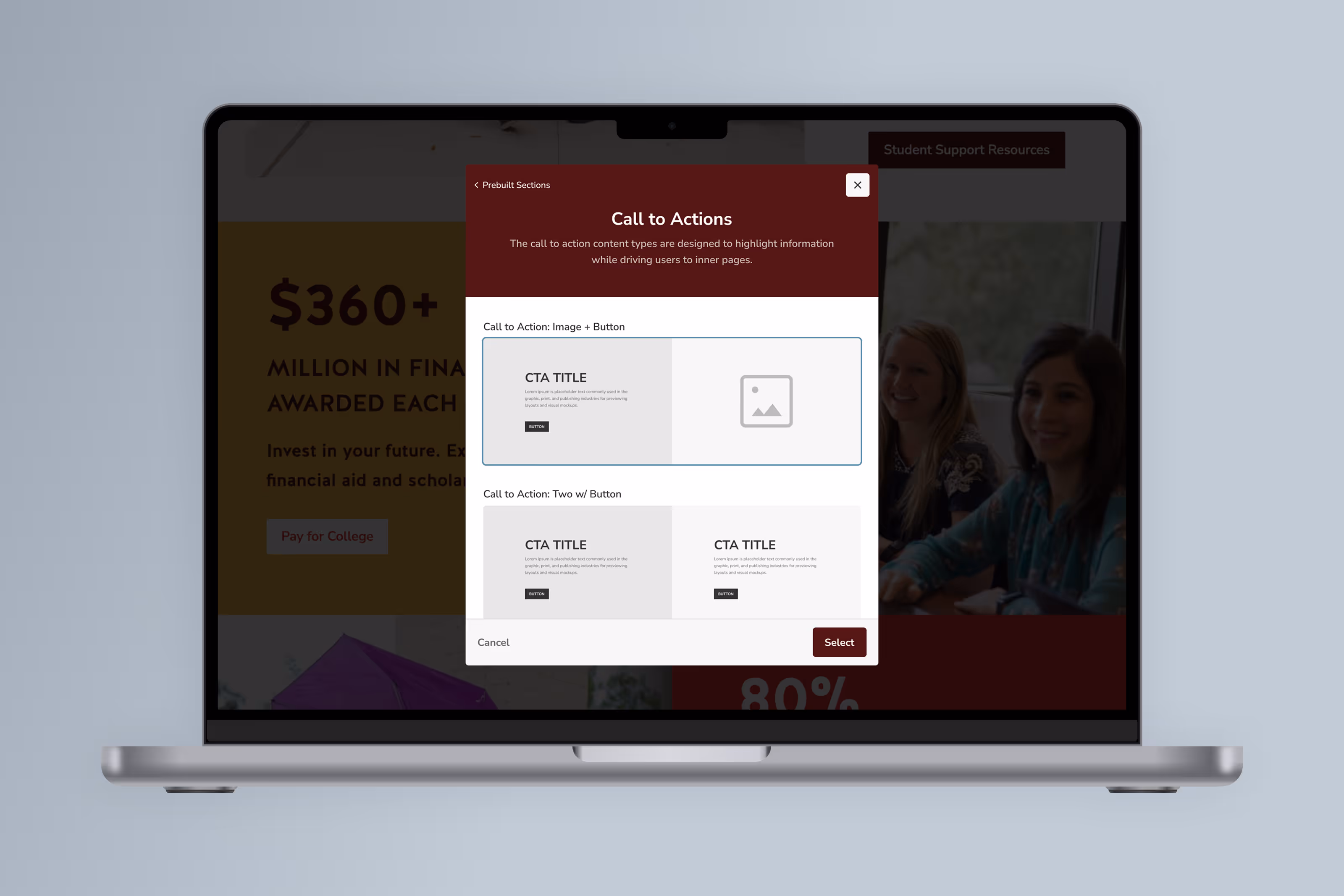
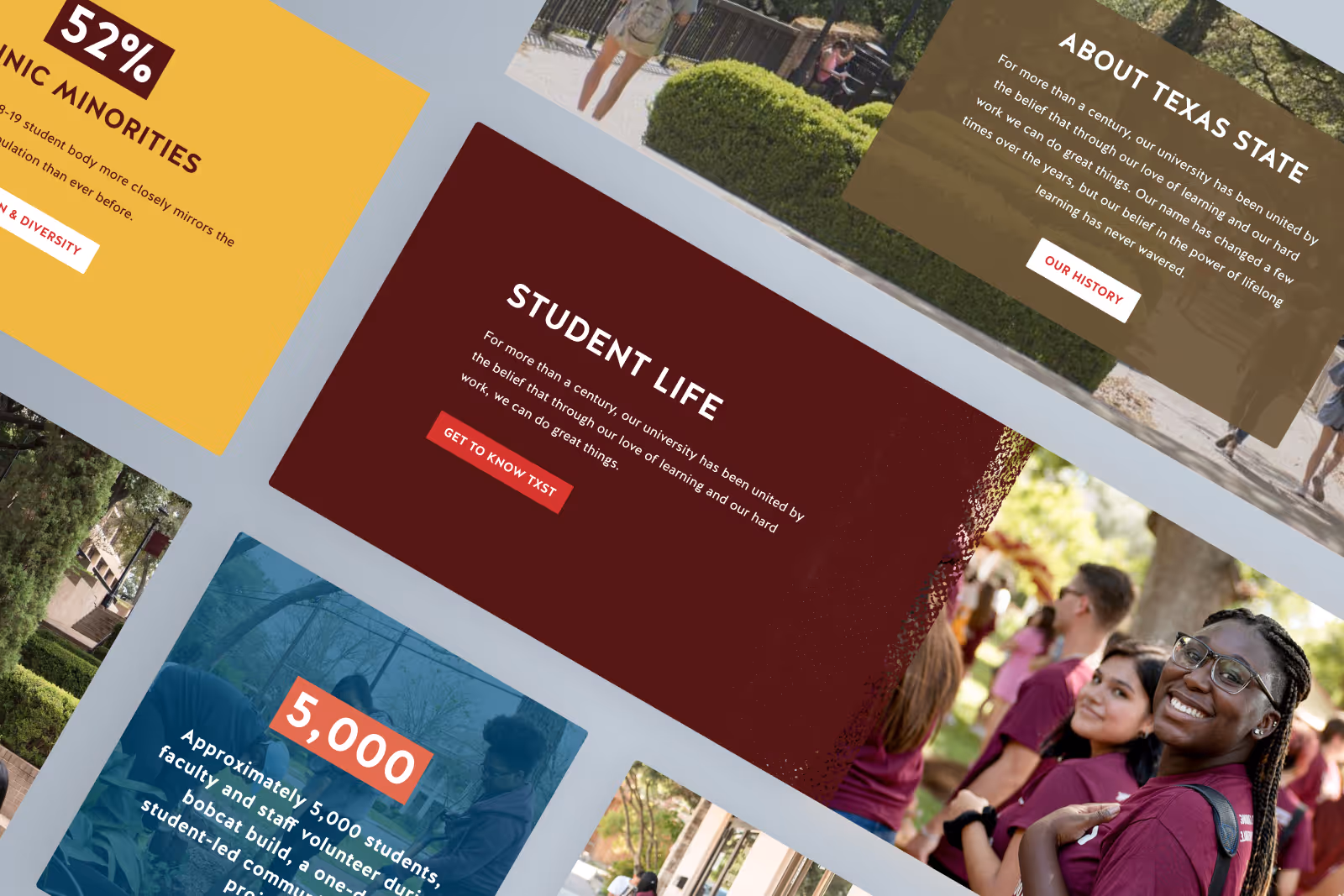
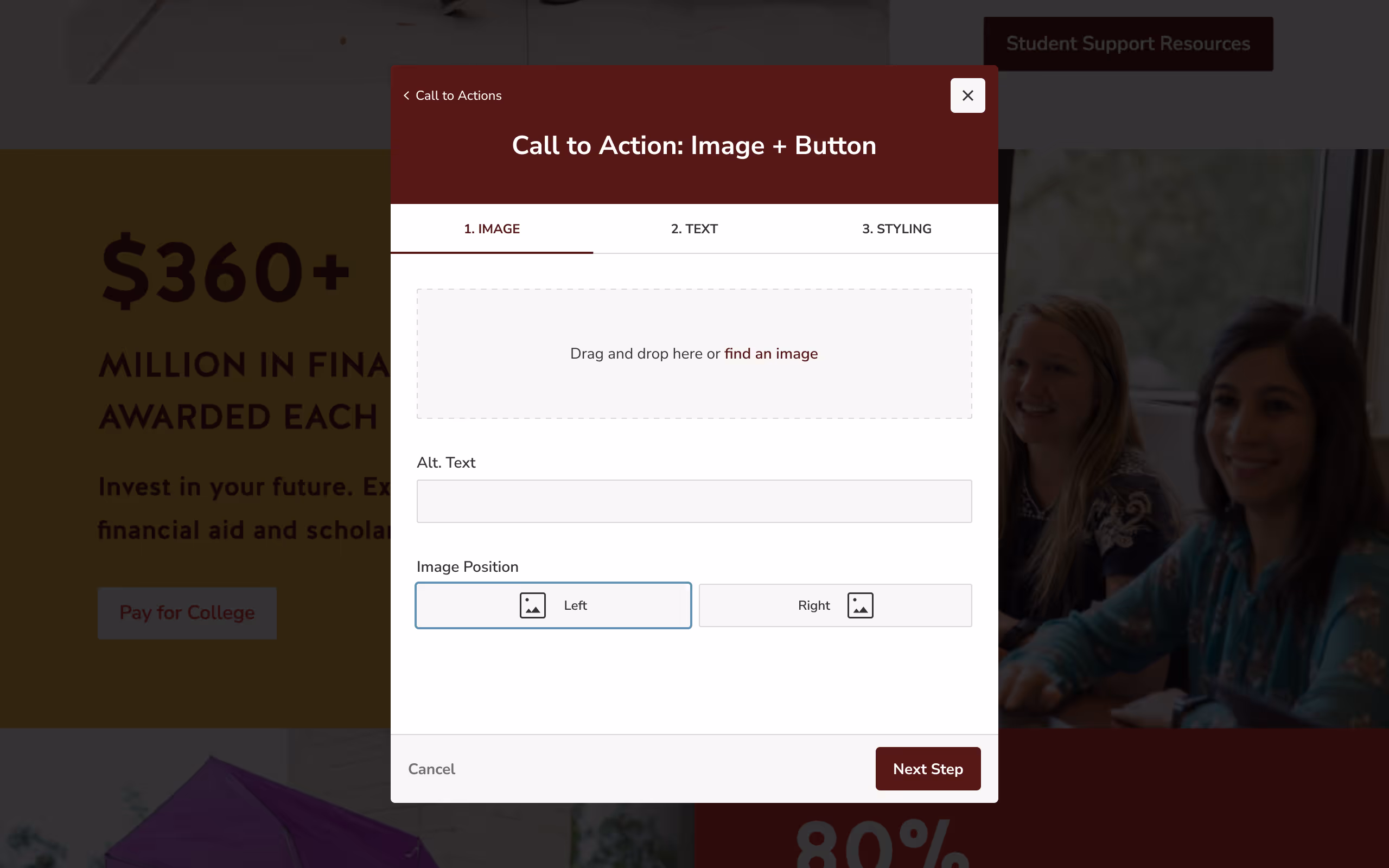
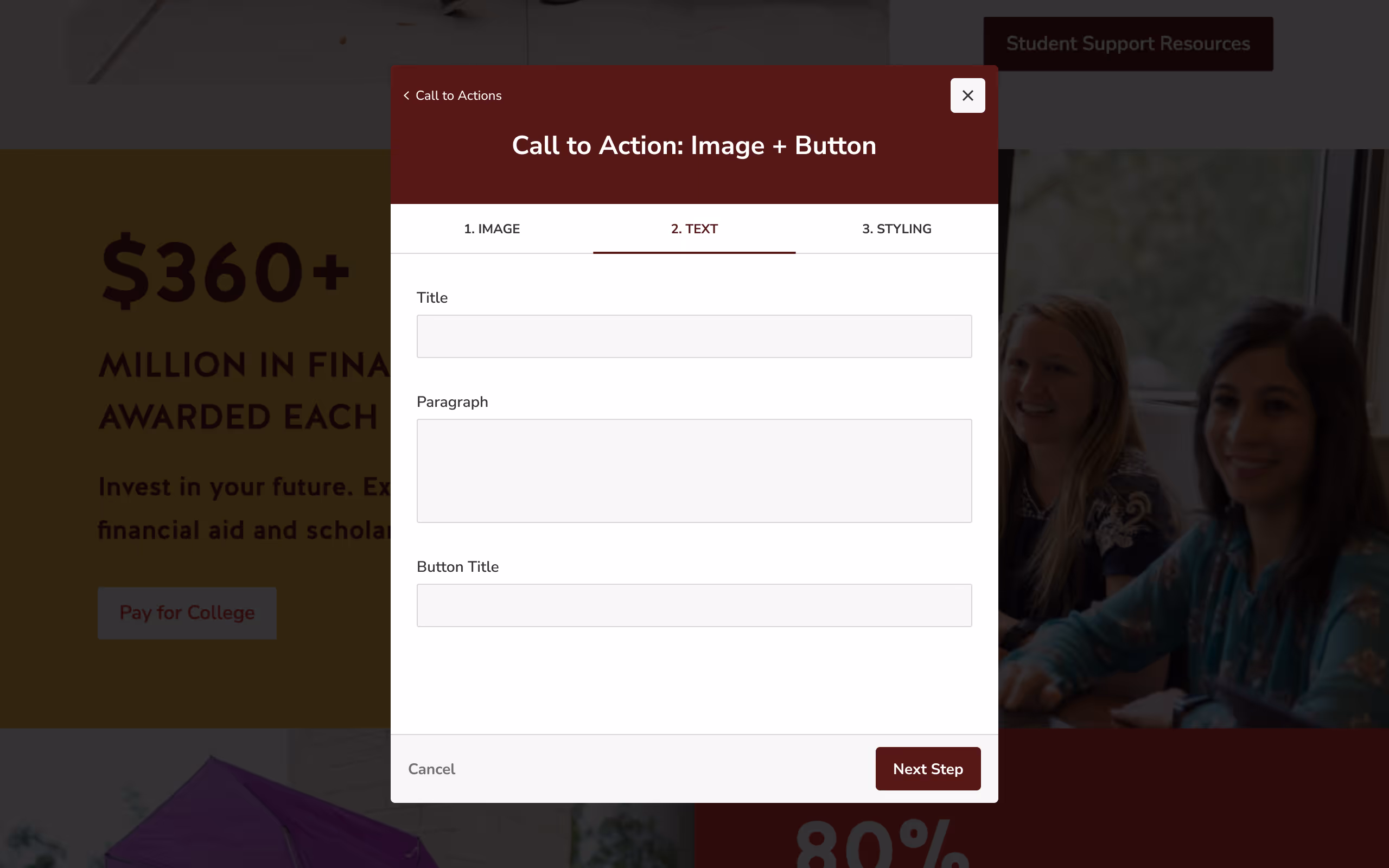
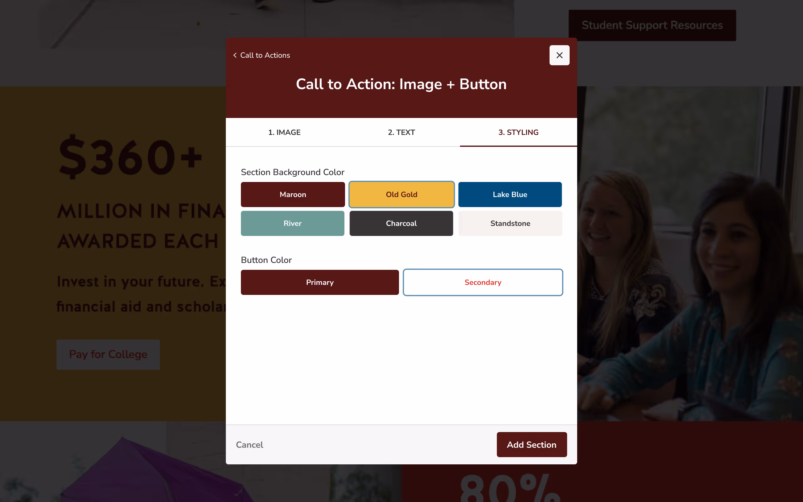
1. Modular Layout System
Editors could select from prebuilt, accessible layout sections rather than starting from scratch. This reduced errors and improved consistency.
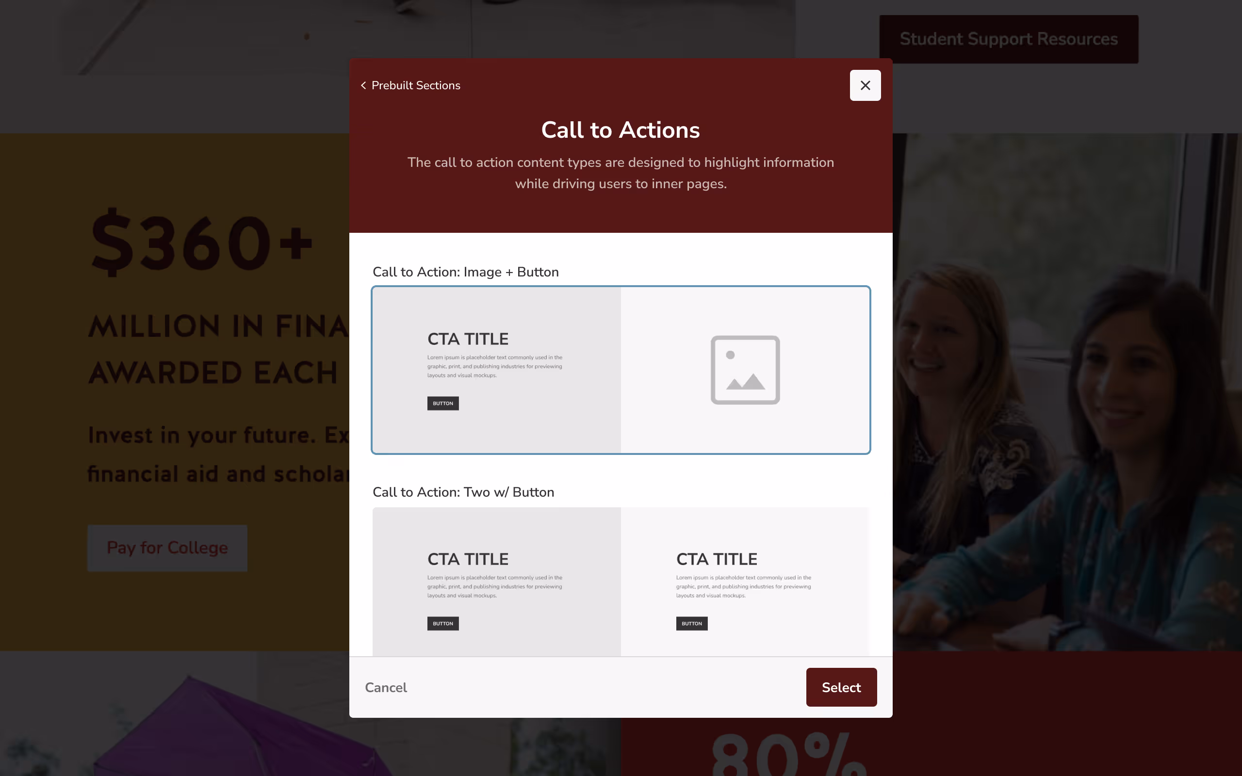
2. Guided Editing Flow
The CMS was restructured into clear, step-by-step flows based on content type, limiting cognitive overload and preventing common mistakes.
Usability Testing
We conducted moderated usability tests with five CMS editors using high-fidelity prototypes.
Results
- All participants preferred the redesigned experience
- Tasks were completed faster with fewer errors
- Users reported higher confidence in the final result
Results & Reflection
The redesigned CMS significantly improved both the editor experience and the quality of sites across the university.
Following launch, departments quickly adopted the new modular templates — including high-visibility pages such as the Texas State homepage and Undergraduate Admissions. Editors were able to build pages faster, with fewer errors, and with far more confidence in the final result.
Outcomes
- Increased consistency across university websites
- Improved accessibility compliance
- Reduced reliance on workarounds and manual fixes
- Higher adoption of standardized layouts
- Faster page creation for non-technical editors
The updated system also contributed to Texas State being recognized as #1 in website accessibility among universities with 20,000+ students.
Reflection
This project reinforced the importance of designing for real-world users, not ideal ones.
Most editors weren’t designers — and they didn’t want to be. By reducing complexity, introducing guardrails, and embedding guidance directly into the interface, we enabled users to create better outcomes without needing deep technical or design knowledge.
Rather than giving users more freedom, the most impactful change was giving them clarity. The result was a CMS that scaled more effectively, supported accessibility by default, and empowered hundreds of editors to do better work with less friction.

Since Chris joined, he’s delivered some of the most impactful and visible product work our team has done to date. His deep understanding of user workflows and platform systems allows him to confidently lead projects and trainings independently. Chris approaches every design with clear intent, balancing user needs, business goals, and technical constraints to create scalable, high-impact solutions.