Simplifying a Multi-Step Checkout Workflow Across Guest and Account States
Reducing friction, improving conversion, and creating a more efficient, scalable user experience.
TL;DR
I led a redesign of Huckberry’s checkout, introducing a guest checkout path that reduced friction while balancing a key business goal of account creation.
This experience required handling multiple user states, conditional logic, and validation flows across guest and account users.
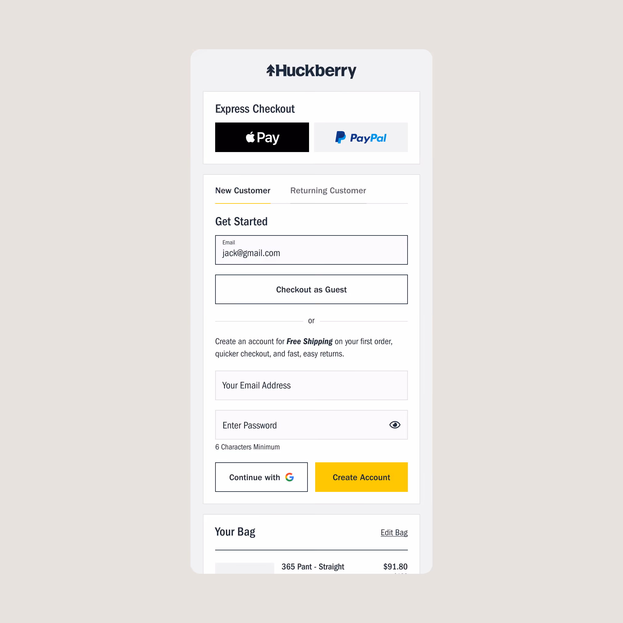
Understanding The Problem
Historically, account creation was the primary lever for customer retention. However, analytics revealed significant funnel drop-off at the authentication gate.
Since signups were a key retention driver, our goal was to test whether introducing a guest checkout flow could reduce friction and improve conversion rates—while still preserving overall signup volume.
.svg)
Designing the Experience
I designed a guest checkout flow as a direct path, while still supporting sign-ups. I also modernized outdated elements, like removing Facebook authentication and aligning UI components to our system.
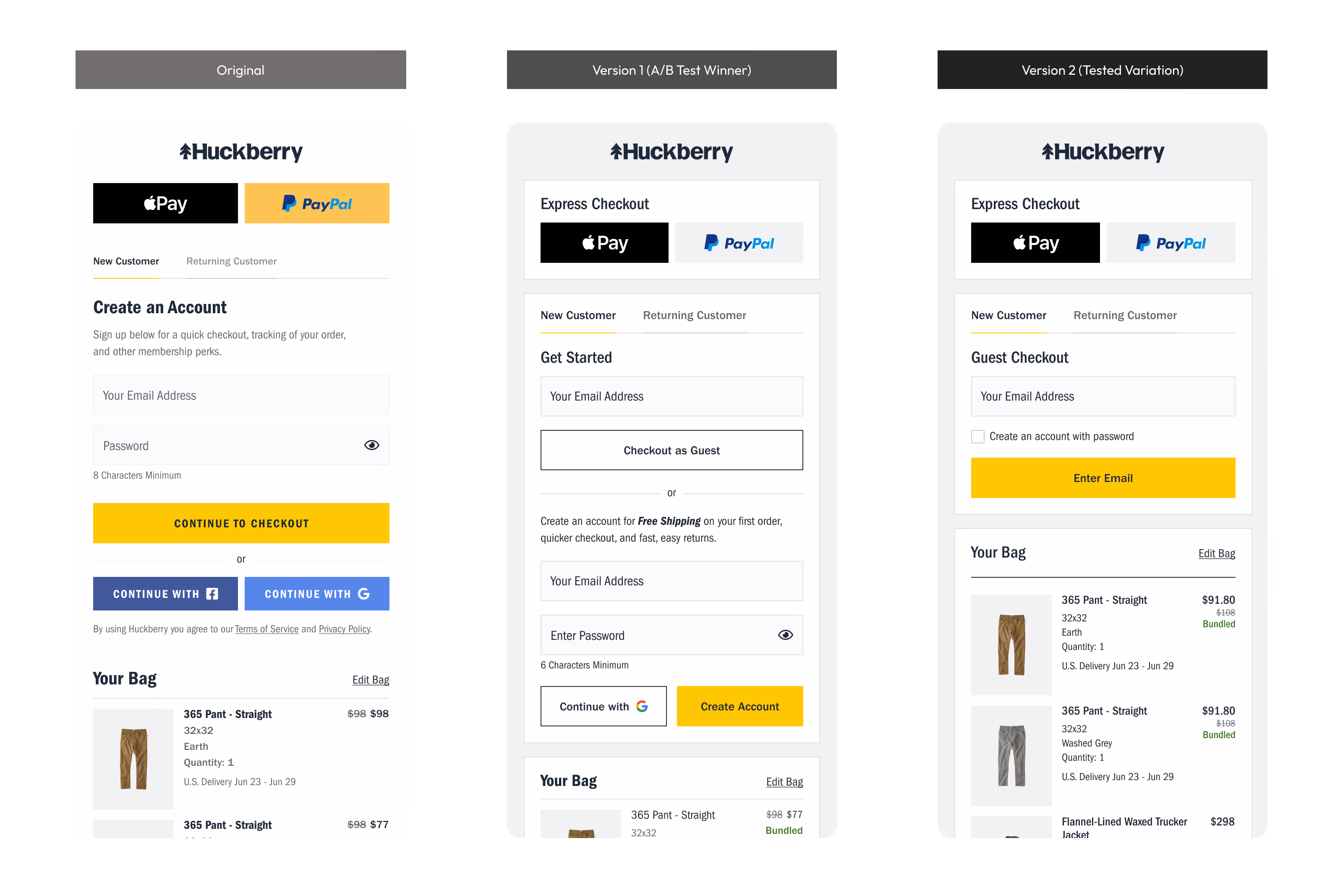
Iteration and A/B Test Validation
To determine the most effective balance between speed and account creation, we tested two variations of the checkout entry experience, focusing on how different approaches impacted user behavior and conversion.
V1 (Winner)
Prioritized guest checkout while maintaining clear visibility for account creation. This approach reduced friction without removing optional engagement, resulting in the strongest performance and becoming the final shipped experience.
V2 (Tested Variation)
Pushed a more aggressive guest-first approach by deferring account creation until later in the flow. While it didn’t outperform V1, it validated that earlier access to checkout was critical and informed future opportunities to reduce friction.
Final Experience
1. Email-First Checkout Entry
A single, low-friction entry point that allows users to move forward without forced commitment.

2. Smart Existing-User Detection
Returning users are recognized and prompted to sign in — without blocking progress.

3. Error Handling & Recovery
Clear, contextual messaging enables recovery without losing progress or trust while maintaining state consistency.

4. Post-Purchase Account Creation
Account creation is offered after checkout, when users are more motivated and less interrupted.

5. Order Lookup for Guests
Non-account users can still access order details easily, reducing CX burden.

Results & Reflection
Reflection
This project reinforced a core belief in my product approach: The most impactful design work removes friction rather than adds features.
V1 confirmed our approach, and post-launch, we treated checkout as an evolving system, continuing to refine based on data and feedback.

Our 6-week Guest Checkout test boosted new-customer conversion by 6.6% and drove an estimated $4.5M in additional annual revenue. Thanks to Chris Jordan for incredible research and new designs simplifying the experience for our customers.