Navigation & Admin Redesign
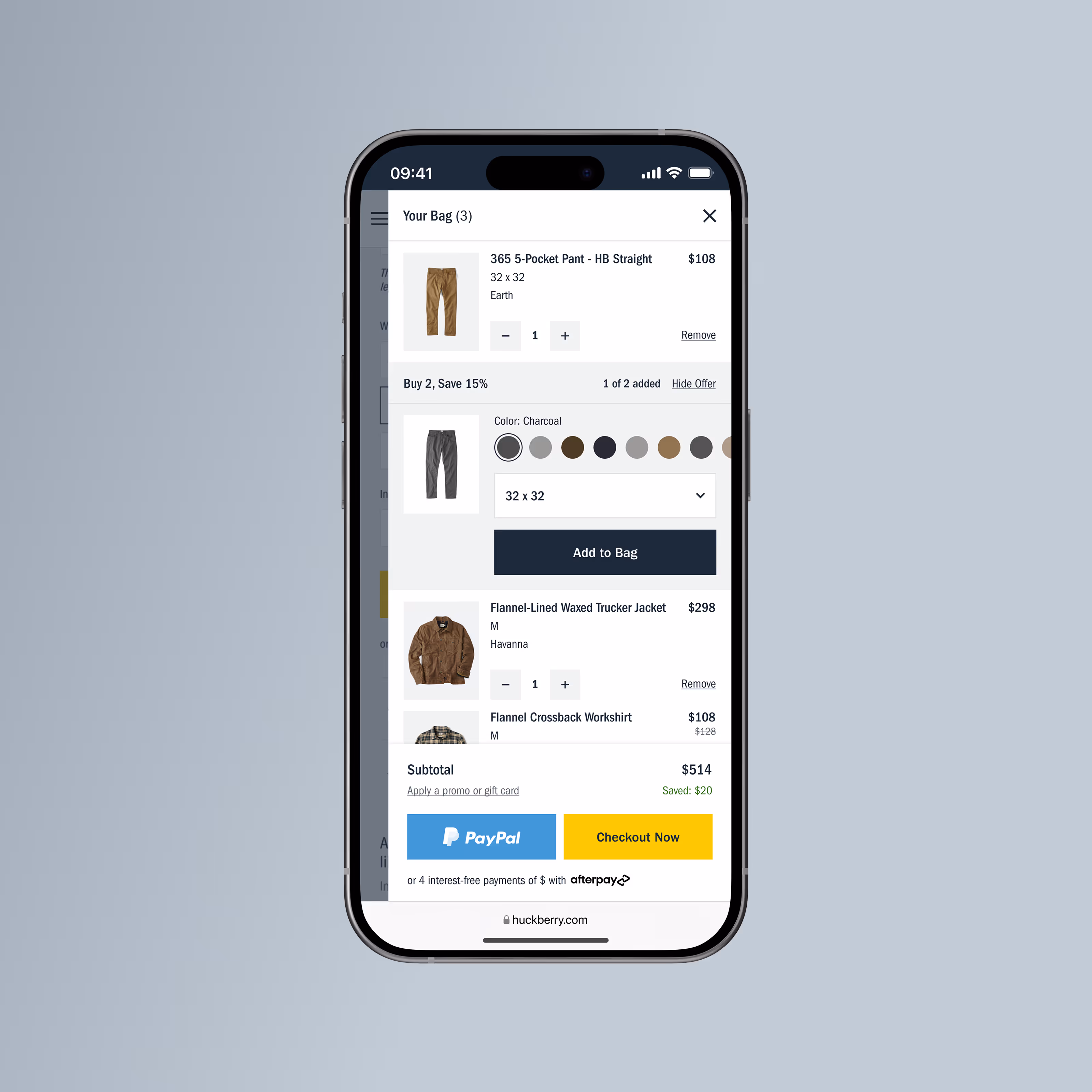
Redesigning checkout to reduce friction, improve conversion, and support both guest and returning users.
.jpg)
TL;DR
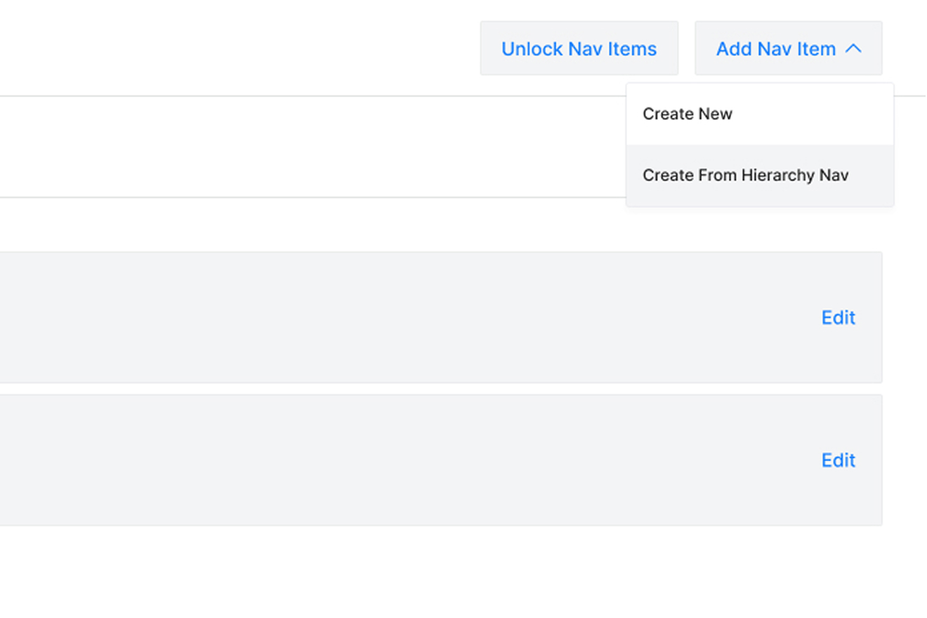
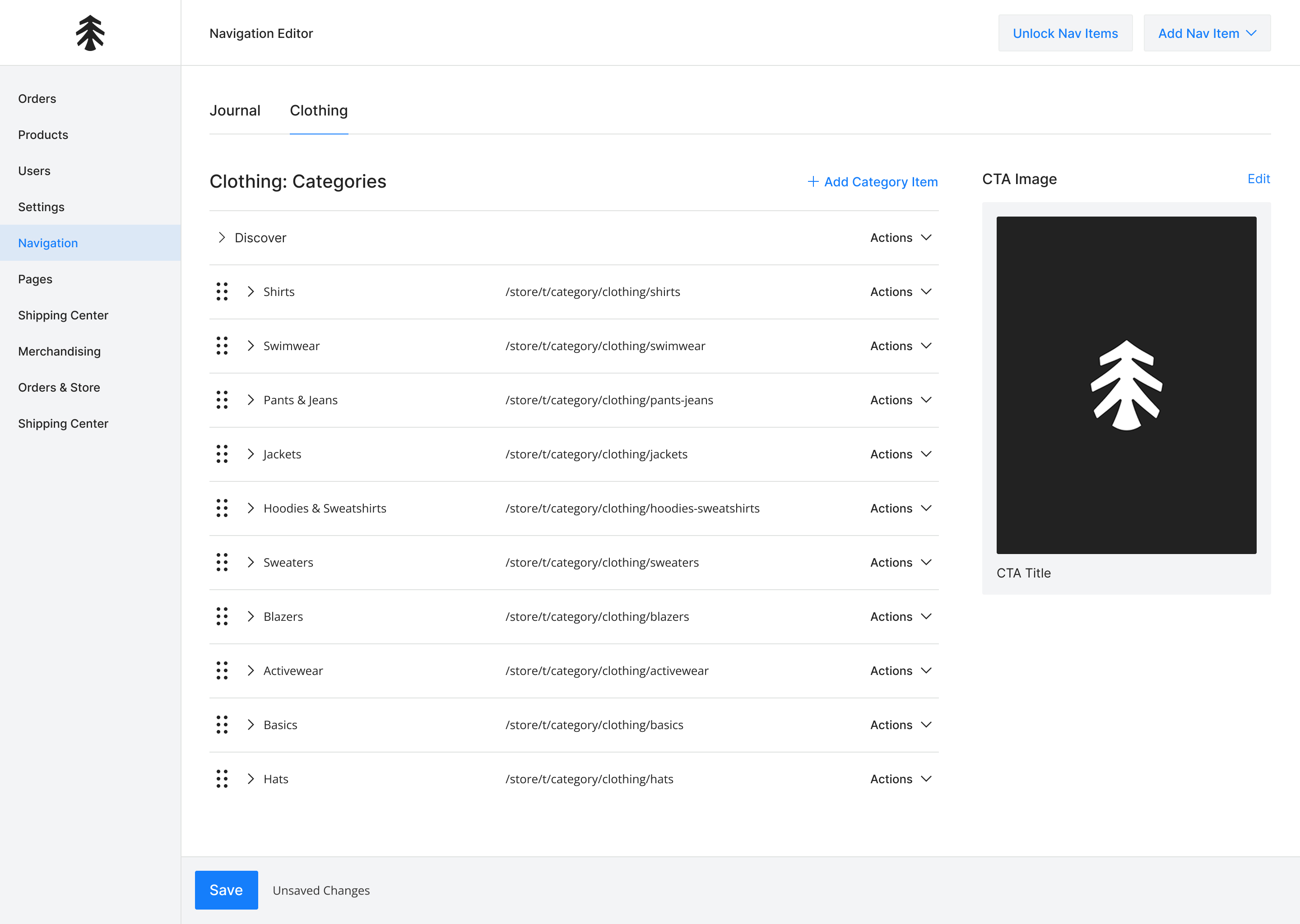
I led a redesign of the global navigation system at Huckberry. By connecting the navigation to the product hierarchy, we reduced internal complexity and improved the customer browsing experience.
Understanding The Problem
As Huckberry’s assortment expanded, its navigation became increasingly difficult for customers to use. Inconsistencies, gaps in category coverage, and an unclear structure made browsing more challenging, while also limiting the team’s ability to effectively showcase the full depth and breadth of the catalog.
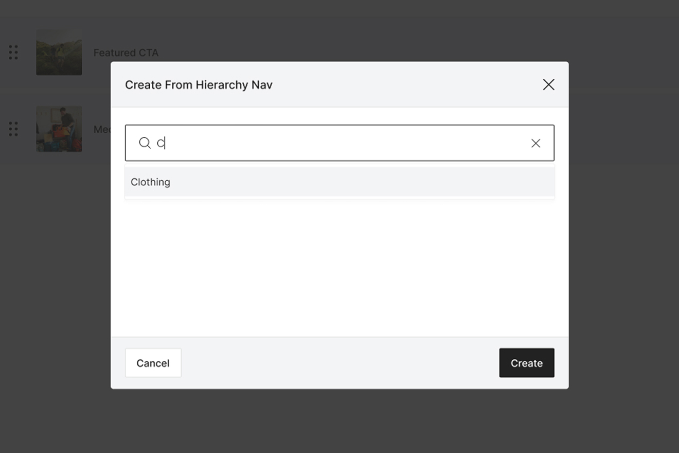
A key issue was that navigation and product category hierarchy were managed in separate systems. This led to frequent mismatches between what customers saw in the navigation and what appeared on product listing pages, while forcing the internal team to duplicate efforts and maintain updates across multiple tools.
.svg)
.svg)
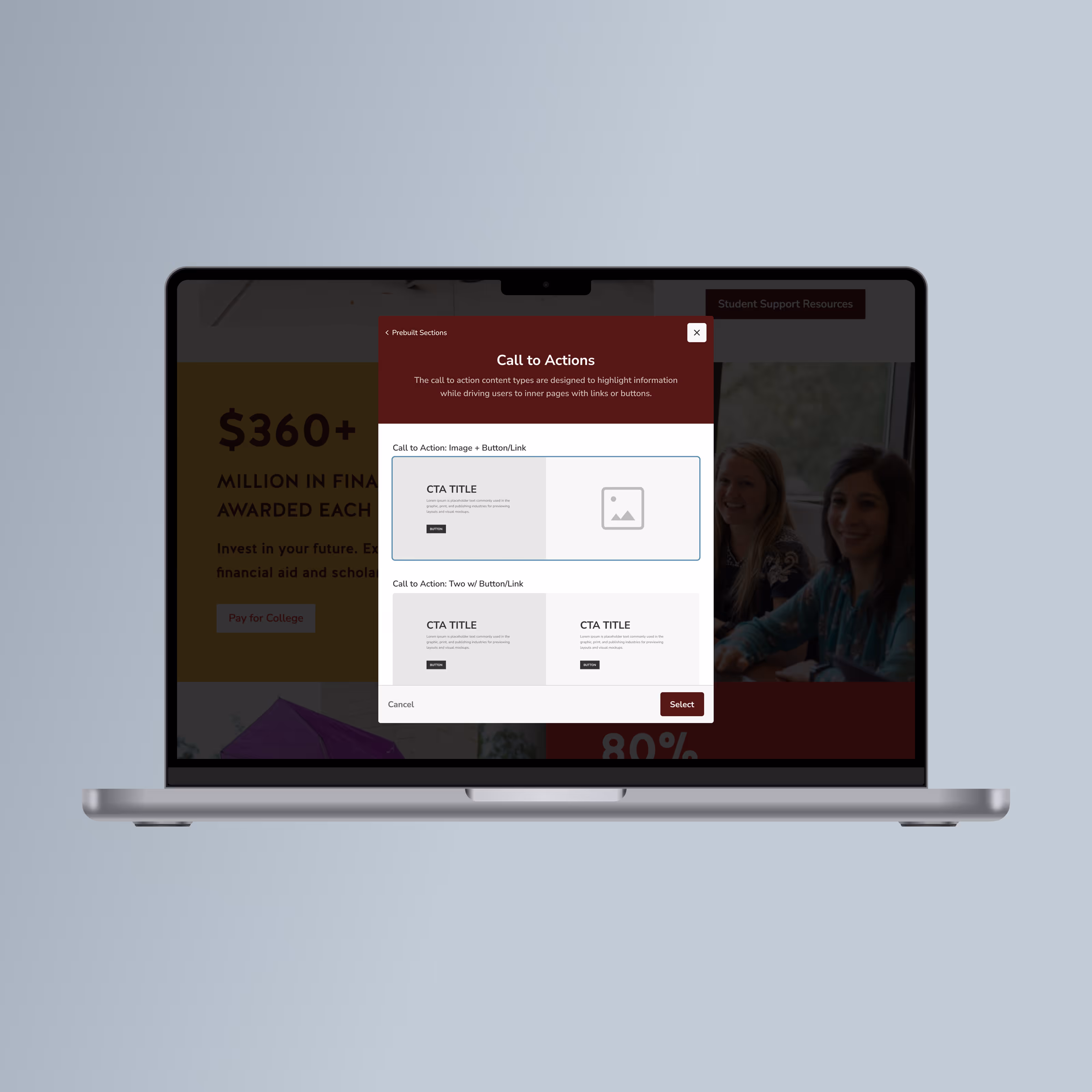
Designing the Experience
I designed a navigation system that synced directly with the product hierarchy. This created a single source of truth, allowing the team to manage categories in one place while retaining flexibility.
Lorem ipsum dolor sit amet, consectetur adipiscing elit. Suspendisse varius enim in eros elementum tristique. Duis cursus, mi quis viverra ornare.
Lorem ipsum dolor sit amet, consectetur adipiscing elit. Suspendisse varius enim in eros elementum tristique. Duis cursus, mi quis viverra ornare.
Navigation Experience
Lorem ipsum dolor sit amet, consectetur adipiscing elit. Suspendisse varius enim in eros elementum tristique. Duis cursus, mi quis viverra ornare.

Final Experience
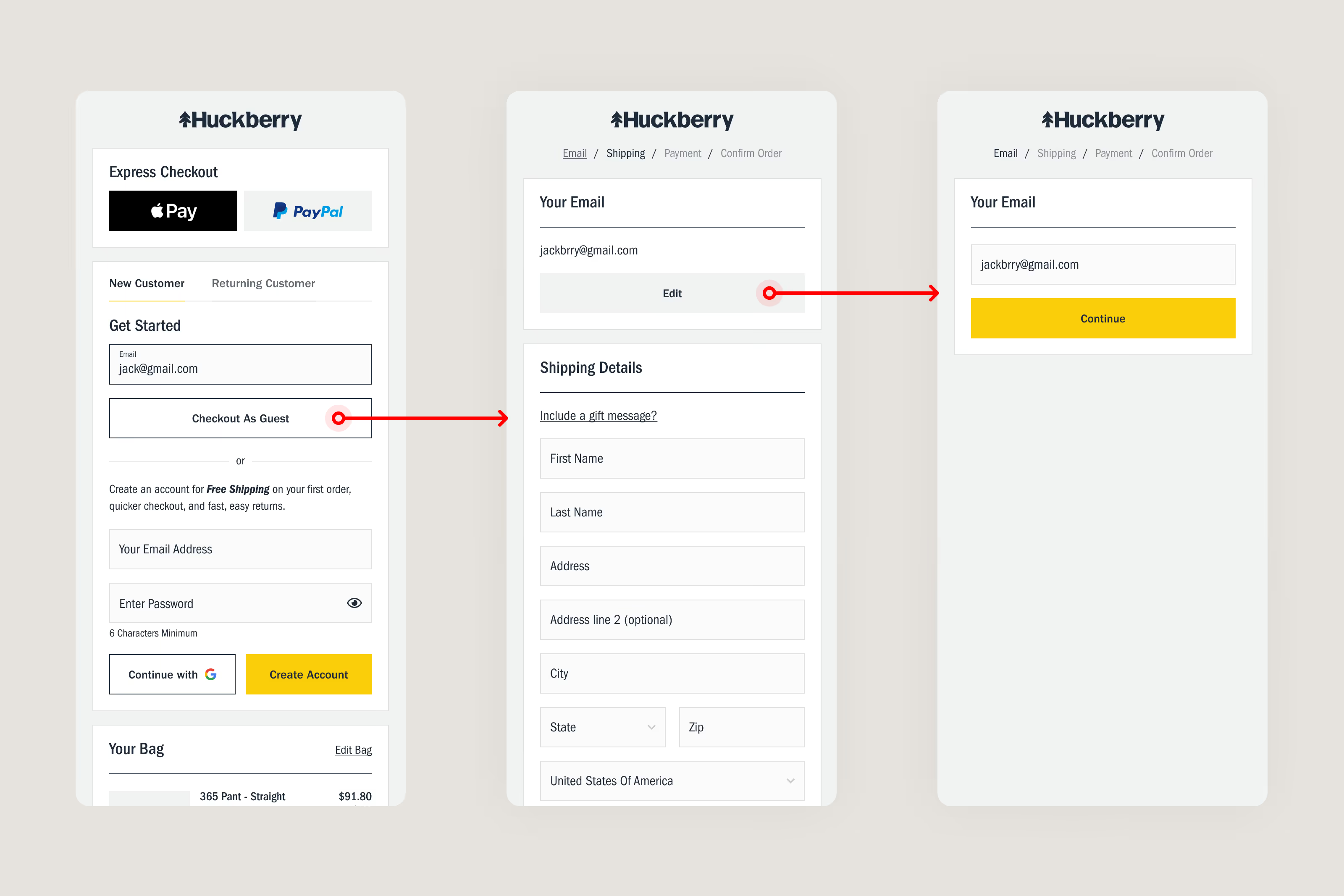
1. Email-First Checkout Entry
A single, low-friction entry point that allows users to move forward without forced commitment.
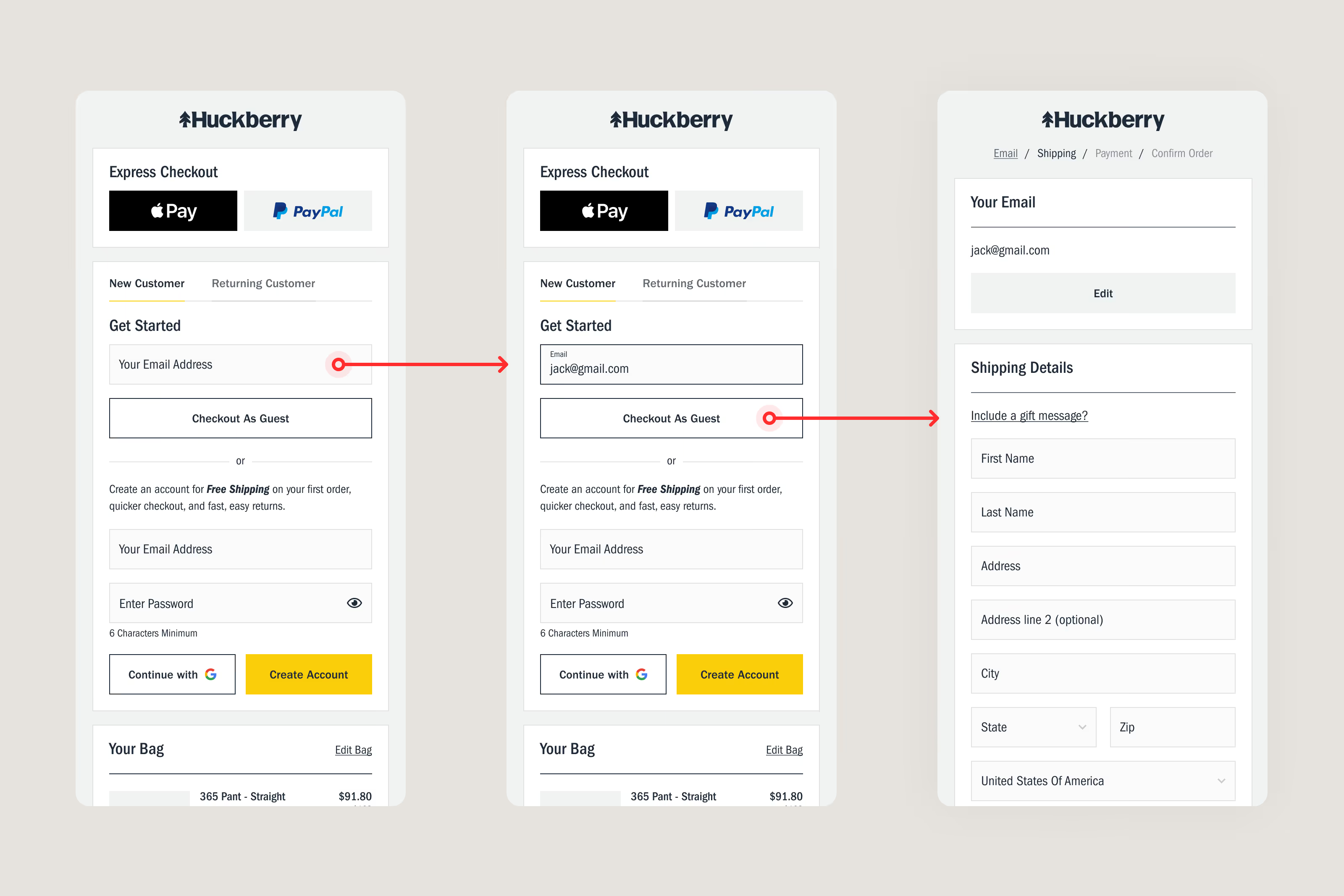
2. Smart Existing-User Detection
Returning users are recognized and prompted to sign in — without blocking progress.

3. Error Handling & Recovery
Clear, contextual messaging enables recovery without losing progress or trust while maintaining state consistency.
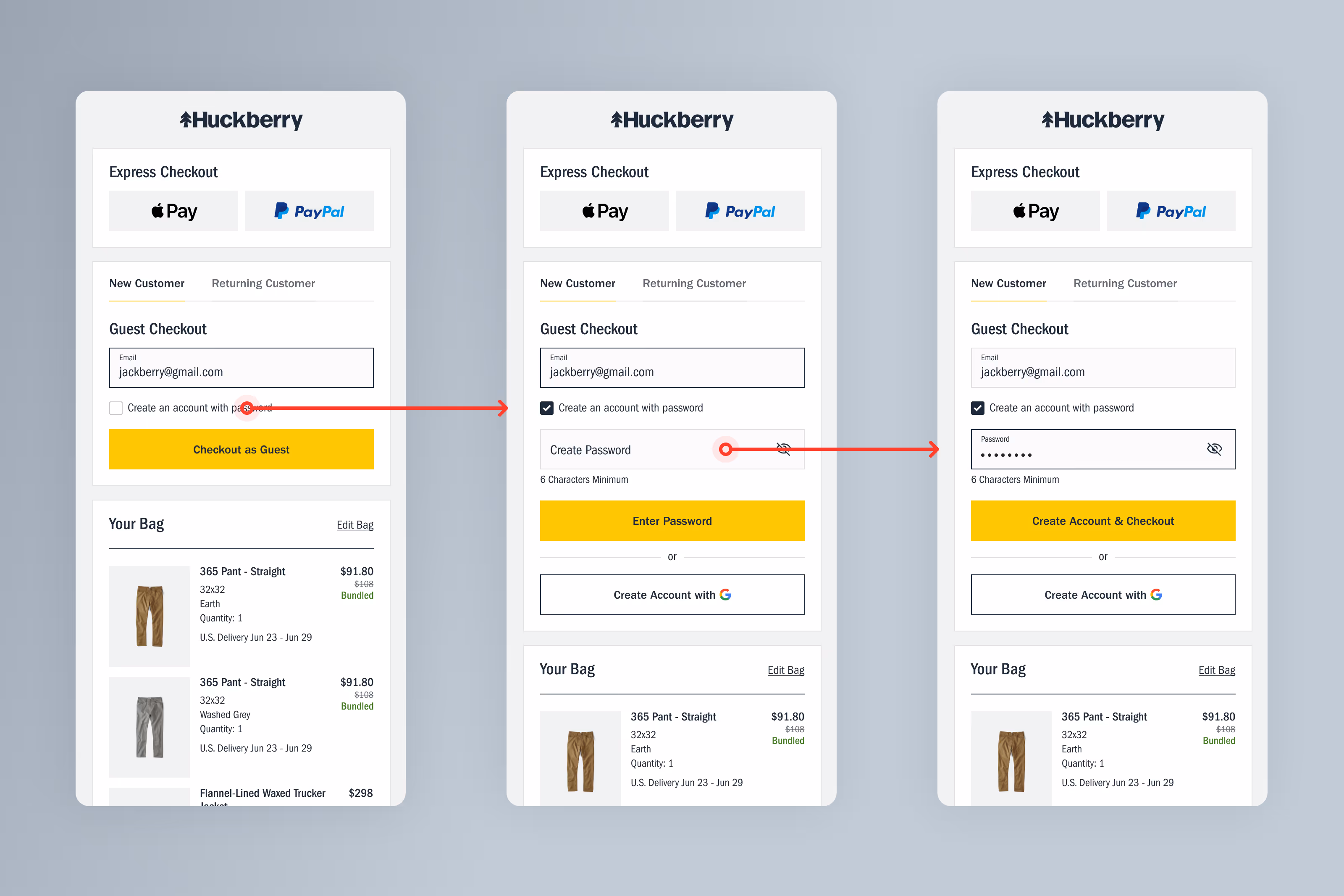
4. Post-Purchase Account Creation
Account creation is offered after checkout, when users are more motivated and less interrupted.

5. Order Lookup for Guests
Non-account users can still access order details easily, reducing CX burden.

6. Full Account Creation Flow
For users who opt in early, the experience remains simple, consistent, and accessible across devices and user states.
Results & Reflection
Outcomes
- +6.56% Orders Placed (Mobile)
- $4.5M in incremental annual revenue
- ~50 additional orders per day
- Reduced login-related CX tickets
Reflection
This project reinforced a core belief in my product approach: The most impactful design work removes friction rather than adds features.
By respecting user momentum and challenging long-held assumptions, we improved conversion, reduced support burden, and created a more human checkout experience — without compromising long-term business goals.
Post-launch, we continued refining the experience based on performance data and CX feedback, treating checkout as a living system rather than a one-time redesign.

Our 6-week Guest Checkout test boosted new-customer conversion by 3.72% and drove an estimated $4.5M in additional annual revenue. Thanks to Chris Jordan for incredible research and new designs simplifying the experience for our customers.